Client: Self initiated
UX/UI Design: Beth Moeur
Date: 2020
Overview
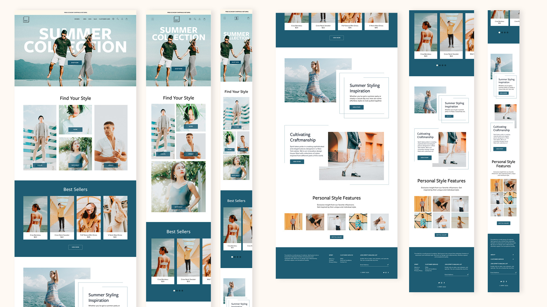
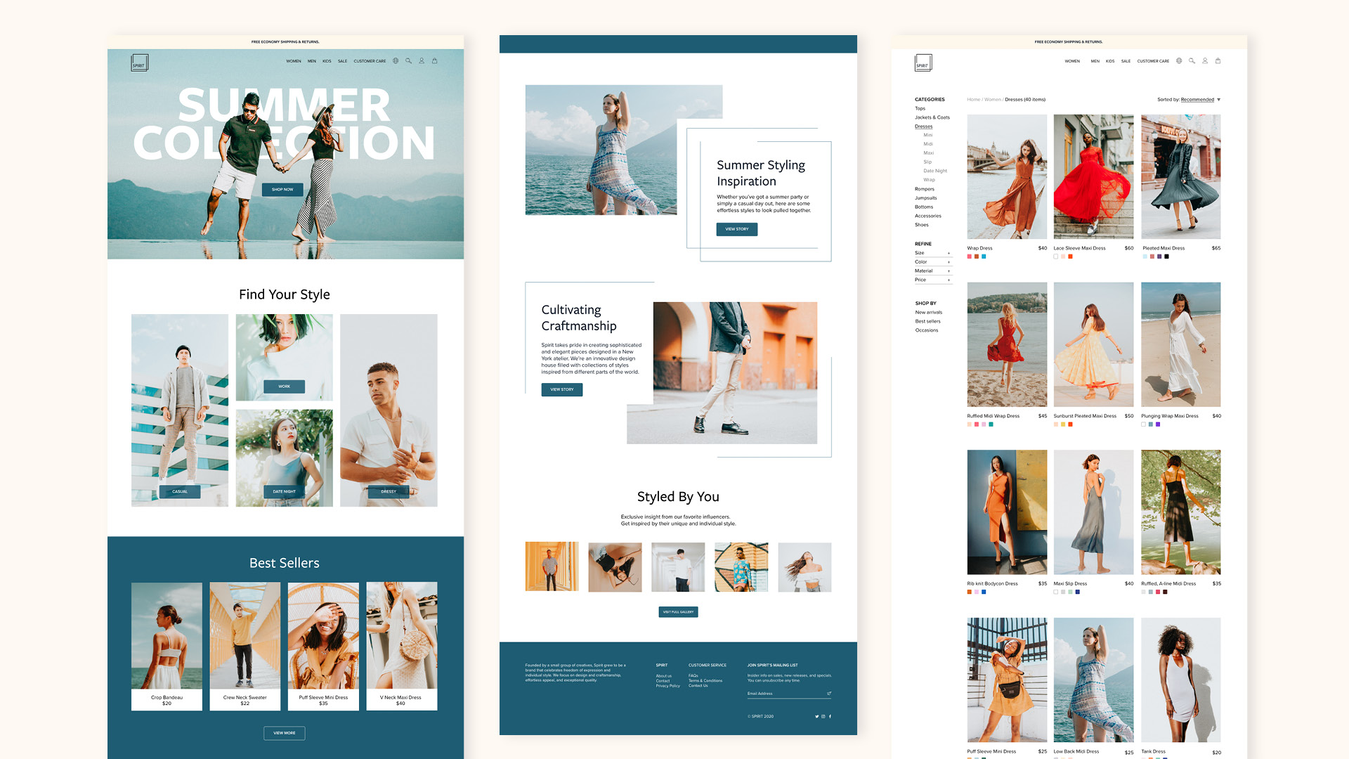
I led the design for a website refresh and brand redesign for Spirit. The client’s site is for e-commerce, and they wanted a design that was more responsive and provided an intuitive shopping experience. I delivered a more personalized and simplified online experience that captures the essence of Spirit.
The Process
1. Discover
Research
Competitive Analysis
User Interviews
2. Interpret
Persona
Project Goals
Card Sorting
3. Ideate
IA
Sitemap
User flow
Task flow
Wireframes
UI
4. Test
Prototype
Usability Testing
Affinity Map
Refine
1. Discover
Research Goals
- Know what features customers look for online
- Understand customer’s online habits and frustrations
- Differentiate brand identity from competitors
- Know what makes the customer want to come back to the site
Research Methodologies:
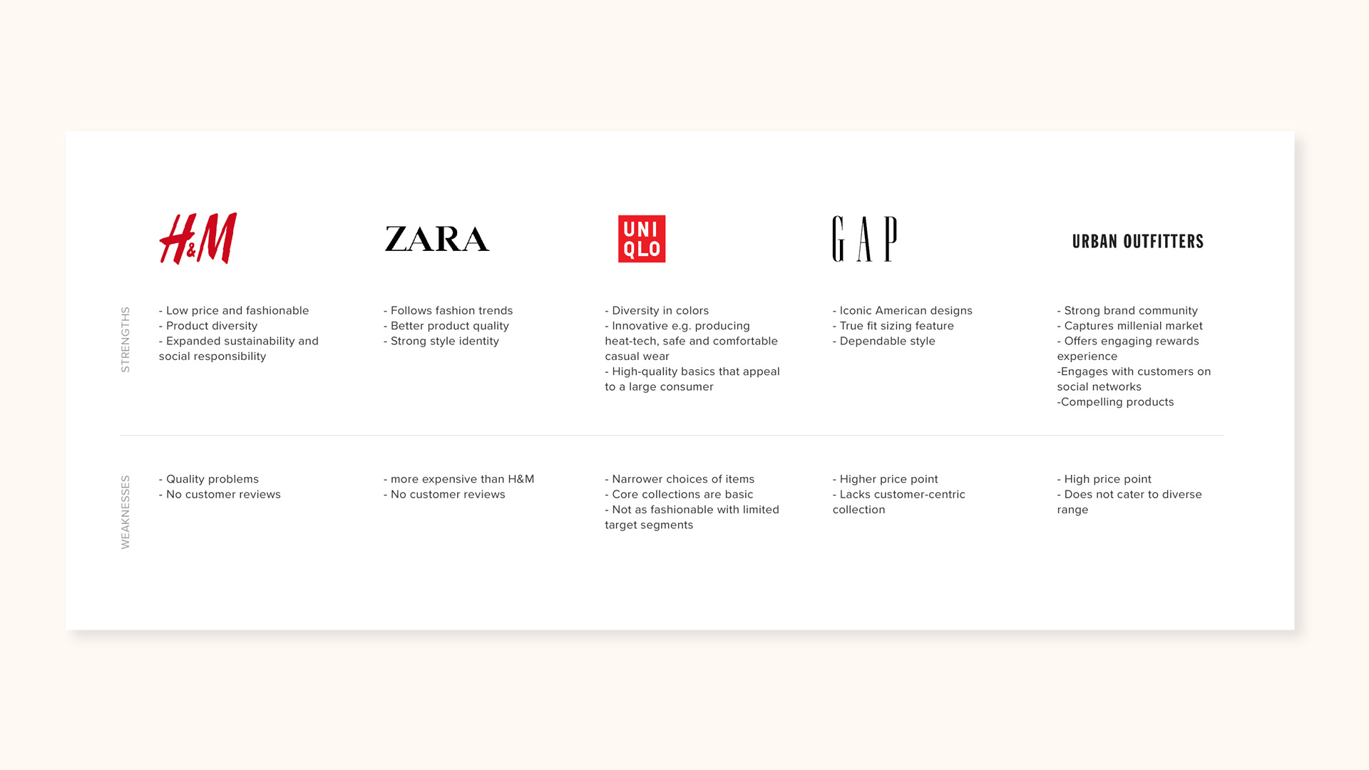
Competitive Analysis
Define competitors and understand current trends that will help set Spirit apart from them.
1 on 1 Interview
To help shape the e-commerce experience, I interviewed four users in order to gain deeper insights into their needs, motivations, and frustrations.
Research Findings
Key takeaways:
Customers want to feel informed
Customers look for reviews, diverse product photos, and well-sorted items. Refined searching helps with the decision-making process and builds trust.
Simplicity
Simplicity is key for easy navigation. Thorough filtering options and a clean layout make the experience more efficient for the customer.
2. Interpret
Based on user insight sessions, I synthesized my findings to create a persona: Dani. This helped me move into the ideation process.
Dani has a keen eye for aesthetics and quality. She enjoys finding clothing that makes her feel unique. Her shopping experience becomes more satisfying when she can efficiently shop through well-sorted items that are represented with diverse, high-quality photos, and detailed information about the quality of products.
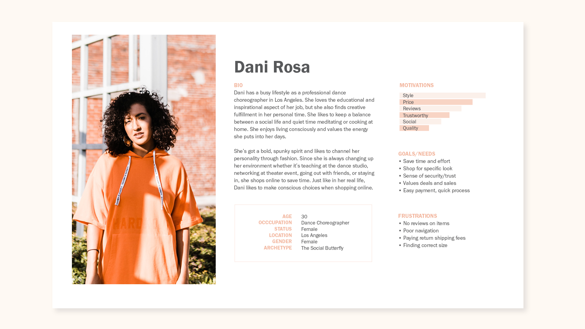
Customer persona
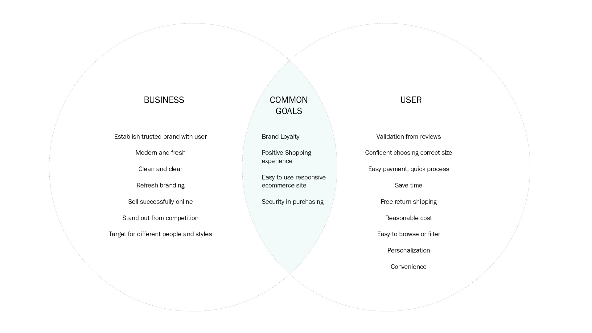
The main pillars integrate users, business, and design to identify project goals. Identifying them at an early stage helped me prioritize key features for the product feature roadmap.
A virtual card sorting was performed through optimalworkshop.com. Eight participants categorized and labeled 30 items related to clothing. This helped me understand how users group different pieces of information within a common category. This led to the initial information architecture I developed.
Card sorting findings
Most categorization was by type (shoes, accessories, jackets, pants, etc.). Some were also categorized by occasion (Sleek Chic Casual, Dressed Up Casual, Dressy Lounge).
3. Ideate
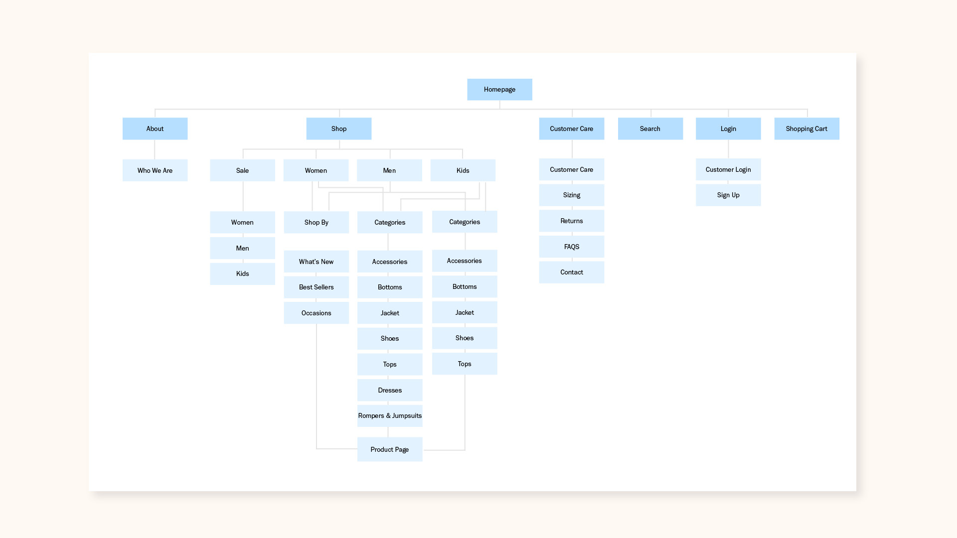
I translated what I interpreted into design solutions and ideas. A sitemap was created to show the overall information architecture for the solution. The structure of this e-commerce site allows users to look and find products efficiently and to make purchases quickly and with ease.
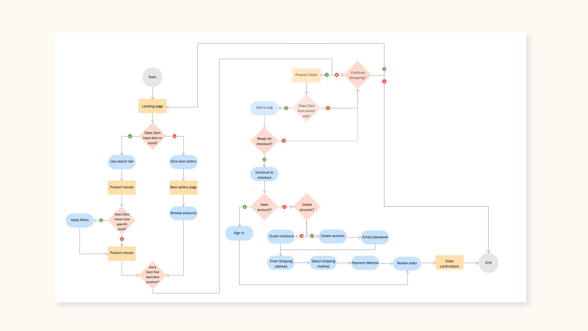
I created a user flow that illustrates the journey of purchasing a product. It shows multiple task flows that a user could take to complete the checkout process.
Design Decisions
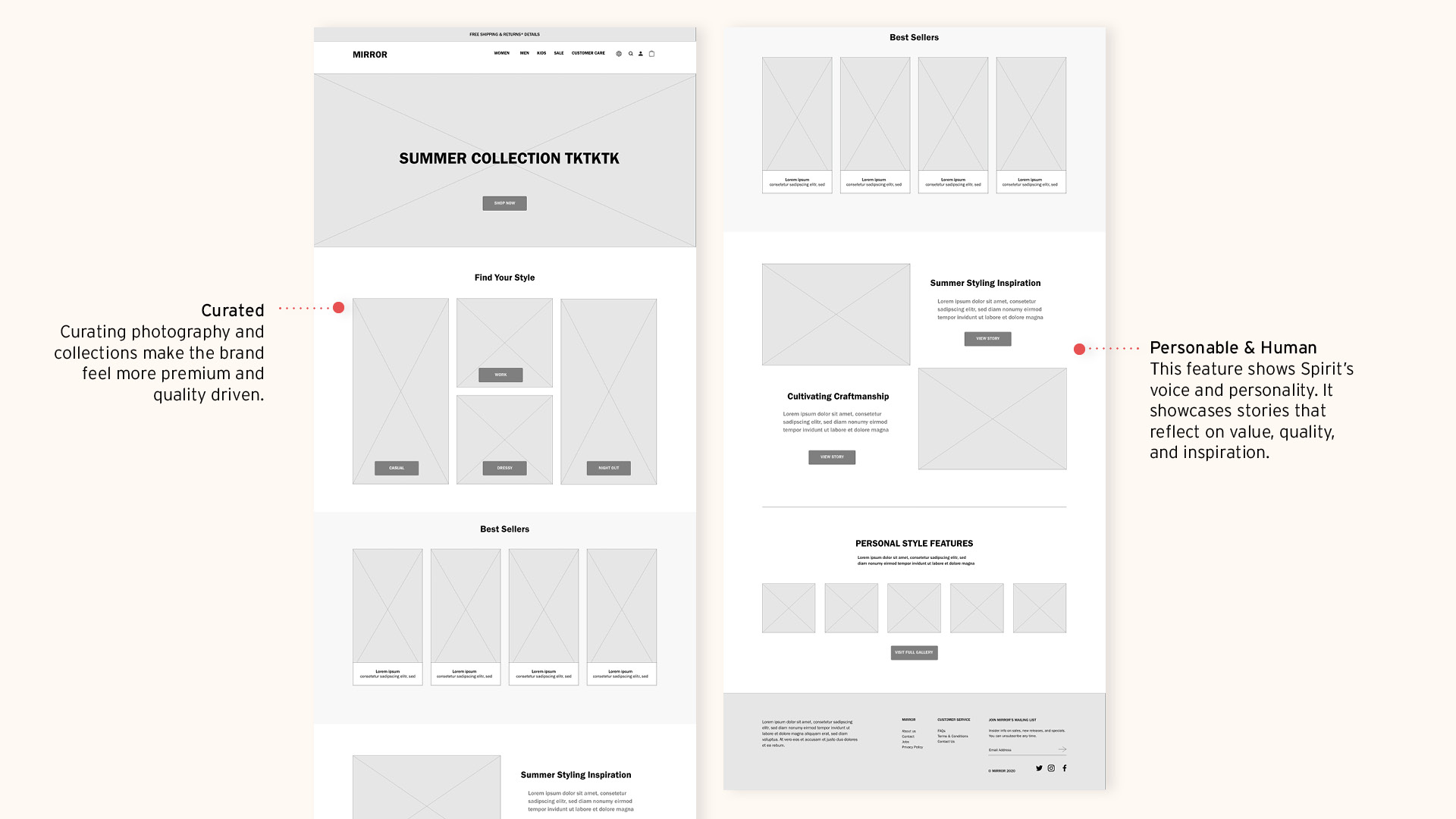
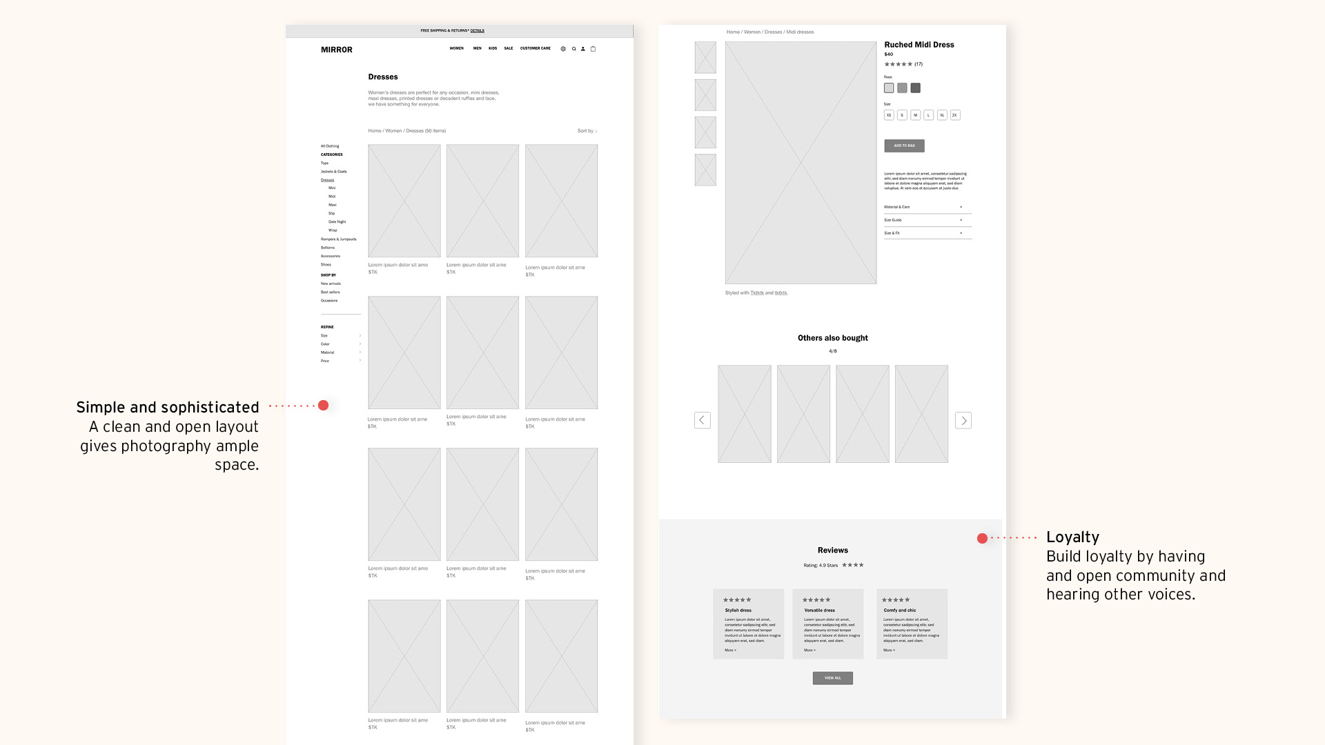
Wireframes were created to target the ideal customer experience, making it curated, personable, simple, and sophisticated.
Customer loyalty
Build loyalty through customer reviews.
Personable & Human
A brand that feels relatable and personable to customers.
Curated
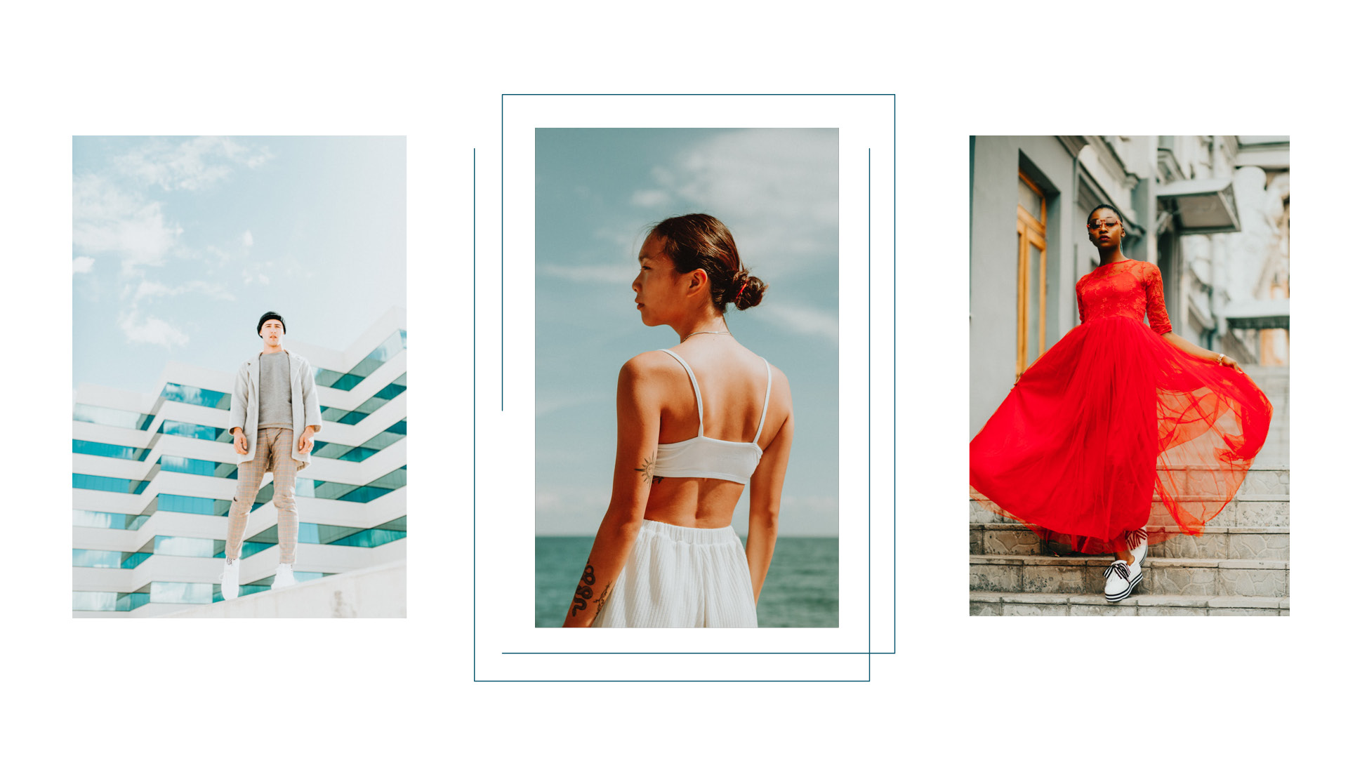
A brand that has consistent standards for quality and style that help connect with its customers. Photography as well as grouping products in “collections” will enhance the curated feel and brand appeal.
Simple and sophisticated
This design approach emphasizes simplicity and gives photography and layouts ample space.
Brand Redesign
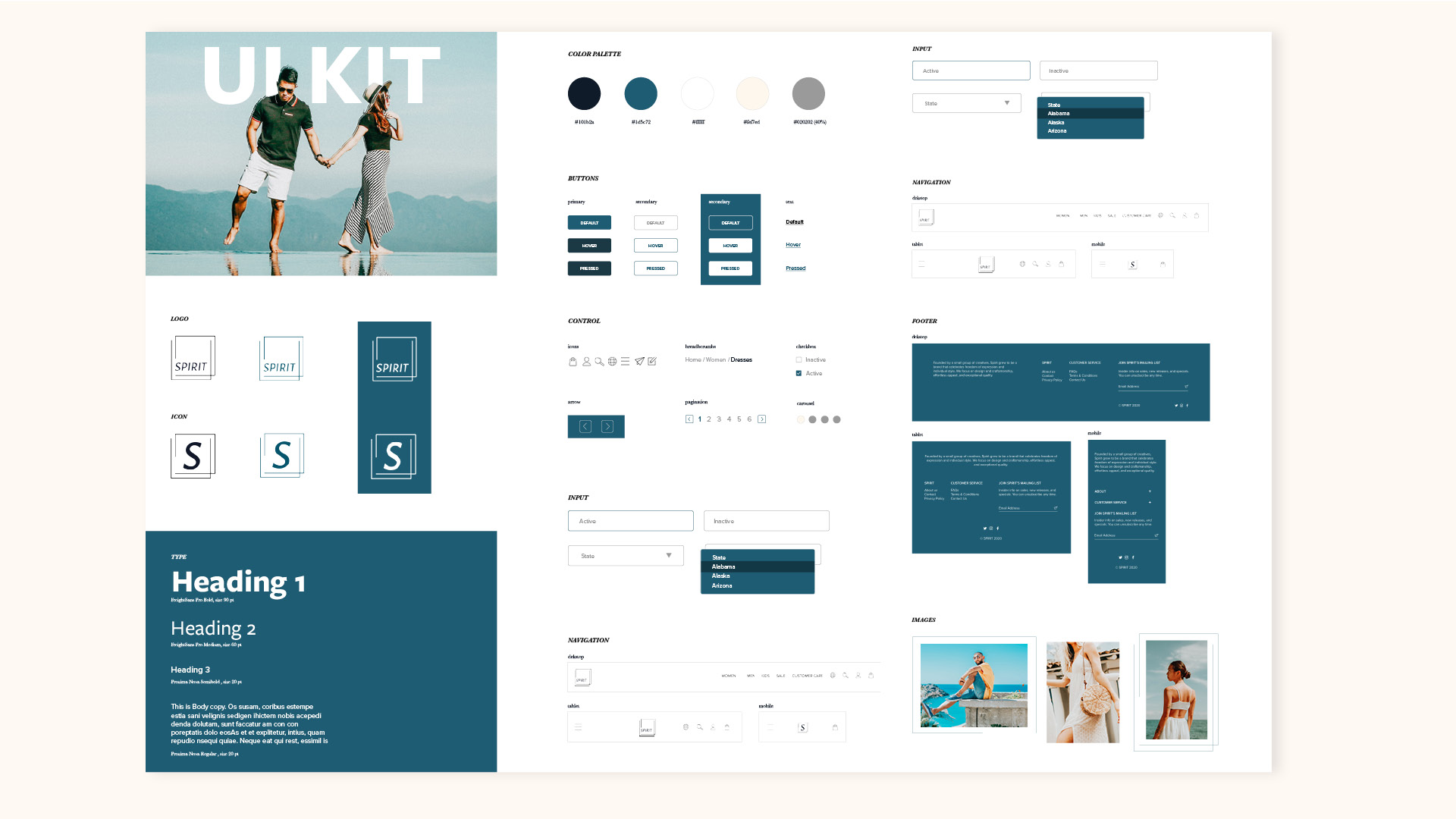
The visual style of the interface encapsulates a modern, fresh, and uplifting brand.
From the photography to the range and names of product collections displayed, a fresh and modern aesthetic is important.
4. Test
Using a high-fidelity prototype, I conducted usability testing with four participants. This helped me to evaluate and clarify my design ideas and gain insights regarding friction points for the three task flows:
- Find the page that displays dress options
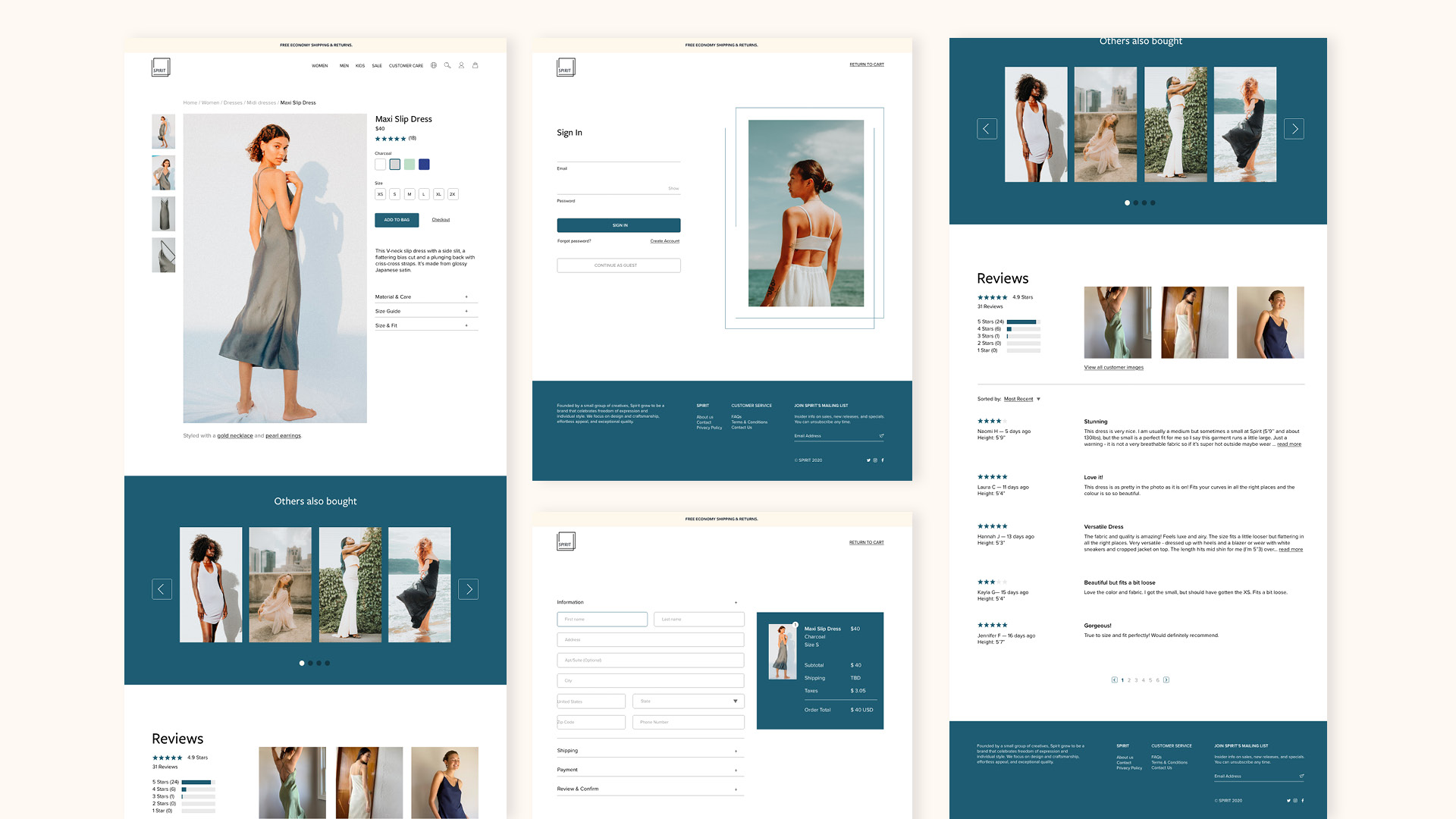
- Shop for that style of dress and get all the relevant information including the reviews
- Buy the dress and check out easily and quickly
An affinity map was created to consolidate patterns in users' feedback and to refine it for optimized usability.
Iterations
Findings
I applied the priority revisions on the final designs:
Show alert message if the customer forgets to select size or color.
Show a pop-up when an item is added to the bag.
Learnings
Seek critical feedback from user research
User interviews were integral to the redesign and led to simple but important tweaks that made for more seamless and straightforward interaction with the customer.
Establishing a cohesive visual brand
It was important to have a distinct style and voice that communicated a fresh and uplifting brand. Having a visual language creates personality and enhances the customer's online shopping experience.
Desktop view of final design
