Client: The Brow Nanny
UX/UI Design: Beth Moeur
Date: 2021
Overview
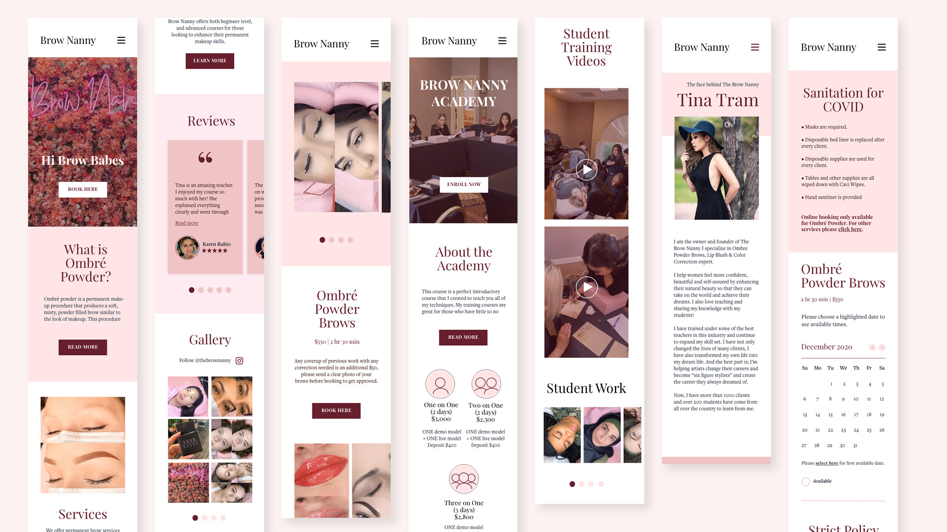
I led the design and direction for a responsive website redesign. The Brow Nanny specializes in permanent makeup, focusing on a technique that creates ombre powder eyebrows. Student training and certification for brows and lip blush are also provided through the current site.
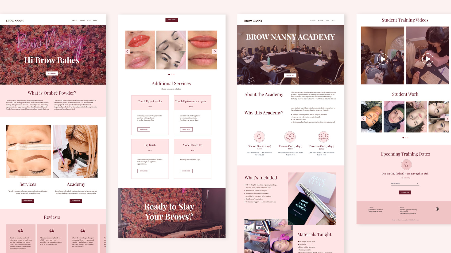
The site redesign needed to be responsive and reflect the client’s brand identity while providing a prospective-customer experience that effortlessly translates into bookings. The goal of the project was to enhance current branding and responsiveness for mobile, tablet, and web.
The Process
1. Discover
Competitive Analysis
User Interviews
Site Evaluation
2. Interpret
Persona
Product Roadmap
3. Ideate
IA
Sitemap
User flow
Wireframes
UI
4. Test
Prototype
Usability Testing
Affinity Map
Refine
1. Discover
I developed a goals-oriented research plan including data collection methods which help me understand the needs and motivations of prospective customers.
Gathering the data
Competitive Analysis
I researched similar, competing services to understand current beauty-related trends. These trends could be integrated with more innovative concepts to help make The Brow Nanny and its services more compelling.
1 on 1 Interviews
I interviewed five users between the ages of 24 and 45. My goal was to understand their experiences with online beauty services and to gain insights into what they hope to achieve through the service, as well as note any pain points and other problems.
Site Evaluation
An evaluation of the existing site was performed by the same users who participated in the interviews. This helped me quickly identify what was working and where there were design pitfalls.
Defining clear outcomes
Key takeaways from research:
Transparency
Ensure visibility of the booking process and details regarding services provided and pricing.
Visual & Informative content
Help customers understand the types of services provided. “Before and after” photos are a critical feature of this kind of service.
Credibility
Prospective customers want legitimacy, reassurance, and trust in beauty services, especially for first-time users.
Old site
2. Interpret
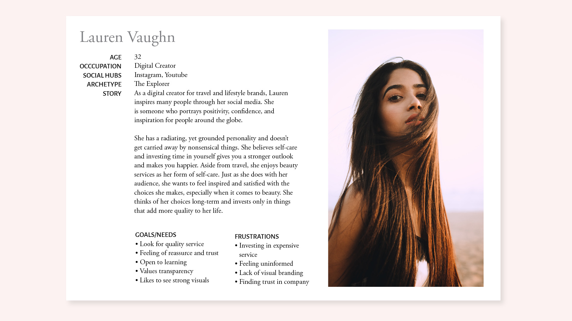
Based on user-insight sessions, I synthesized my findings to create a persona: Lauren. This helped me move into the ideation process.
Lauren likes to have a straightforward booking experience and to be well-informed on the beauty services provided. She looks for quality and trust in a person's work. This makes her more assured about investing in an expensive service.
3. Ideate
I synthesized the data and user insights to create a structure and system that encompasses the IA and sitemap.
The old sitemap lacks differentiation among the beauty services and educational training that The Brown Nanny provides. To emphasize these two categories more clearly, the modified sitemap's new structure has separate interface pages on each topic, providing a stronger hierarchy within the information architecture.
Before vs. After of sitemap
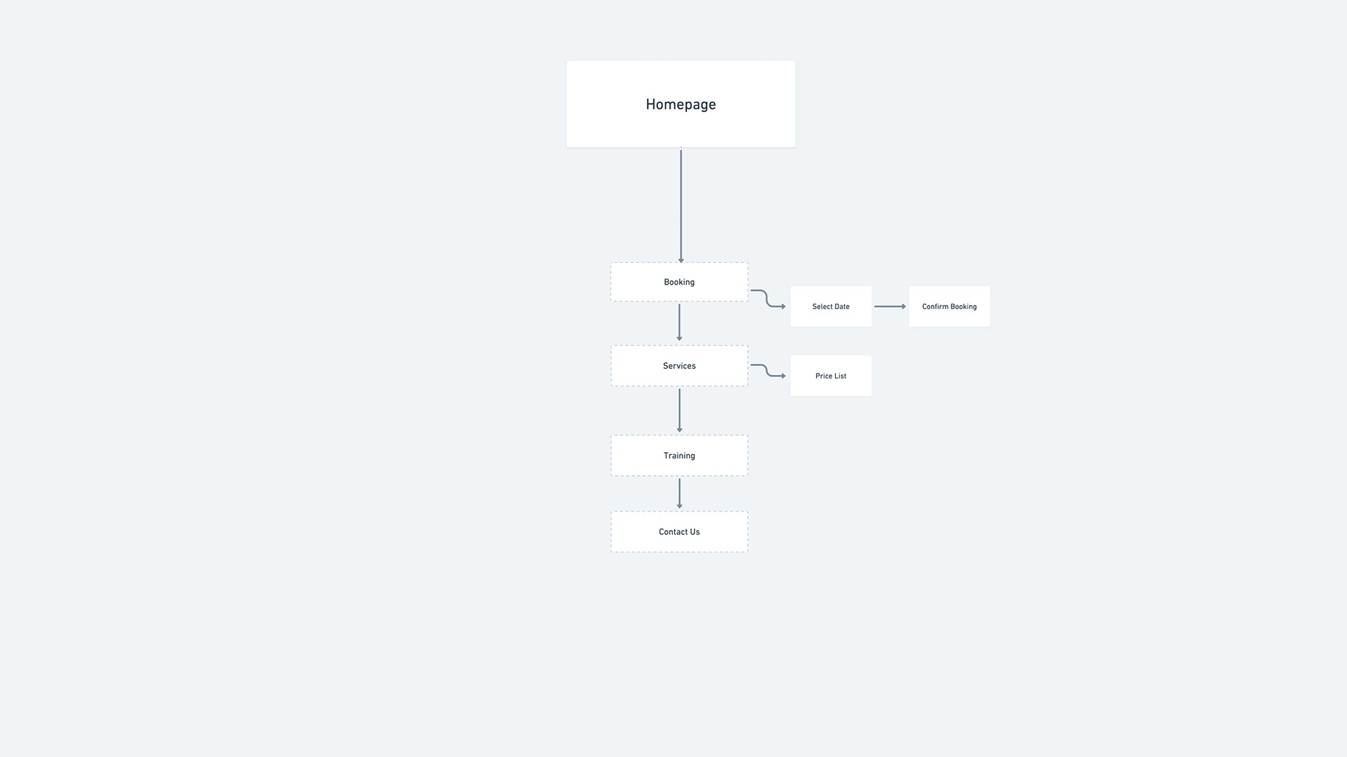
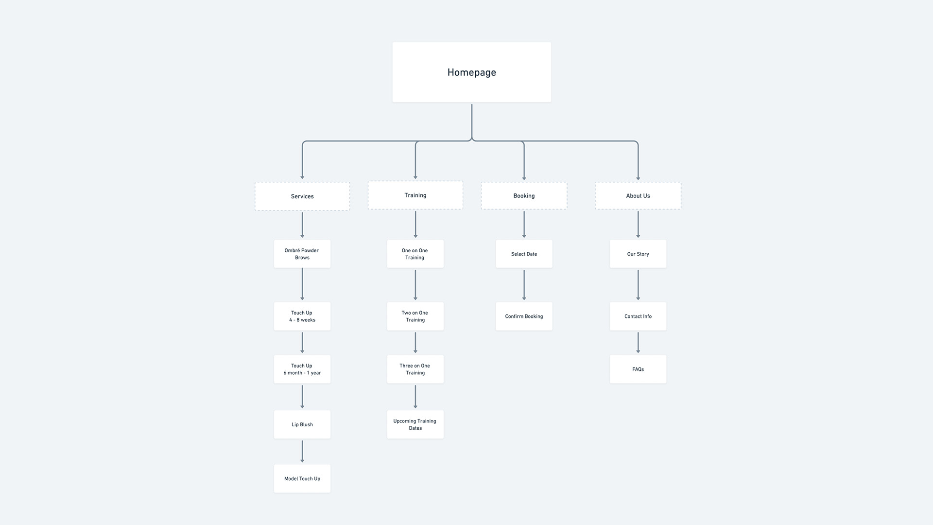
Original sitemap (left), Modified sitemap (right)
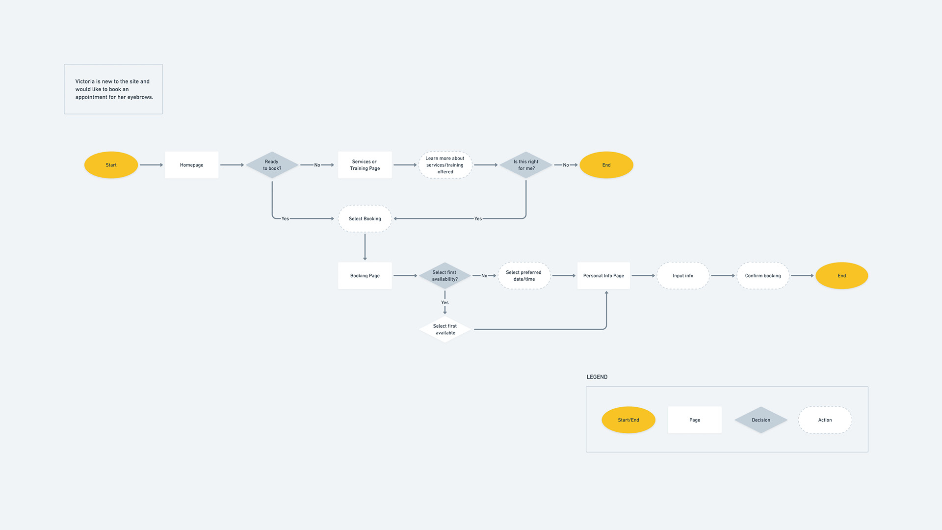
After establishing user needs, I created a user flow that encompasses all possible pathways to booking an appointment.
Design Decisions
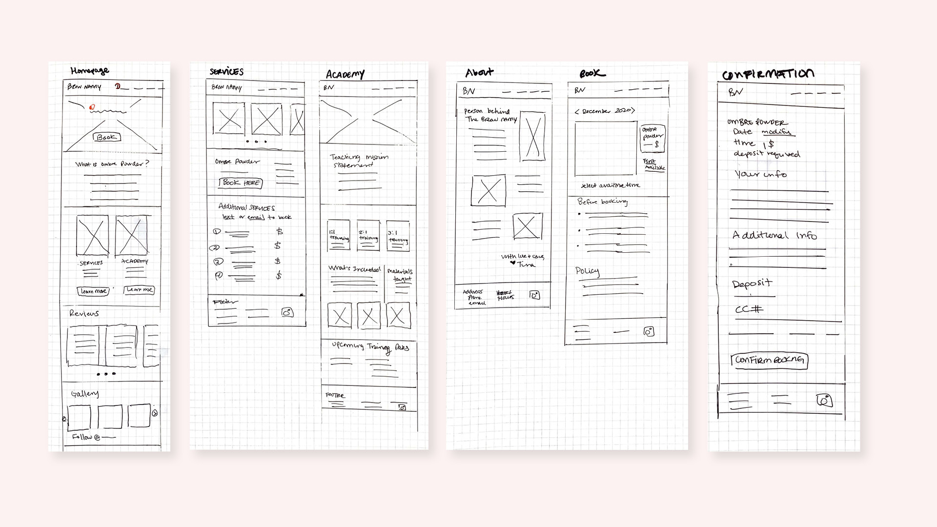
The prospective customer should feel confident in choosing a service for which they are intuitively guided through the booking experience. Key features were highlighted to help guide my design process from journey flow to sketches.
Credibility
Transparency from the service providers behind The Brow Nanny is vital to help form a connection with clients.
Educational & informative content
Offer a thorough understanding of the booking process and services provided.
Reviews
Reviews from customers create legitimacy and trust in the company, especially for permanent makeup.
Visuals
Quality of work is heavily determined by before and after photos.
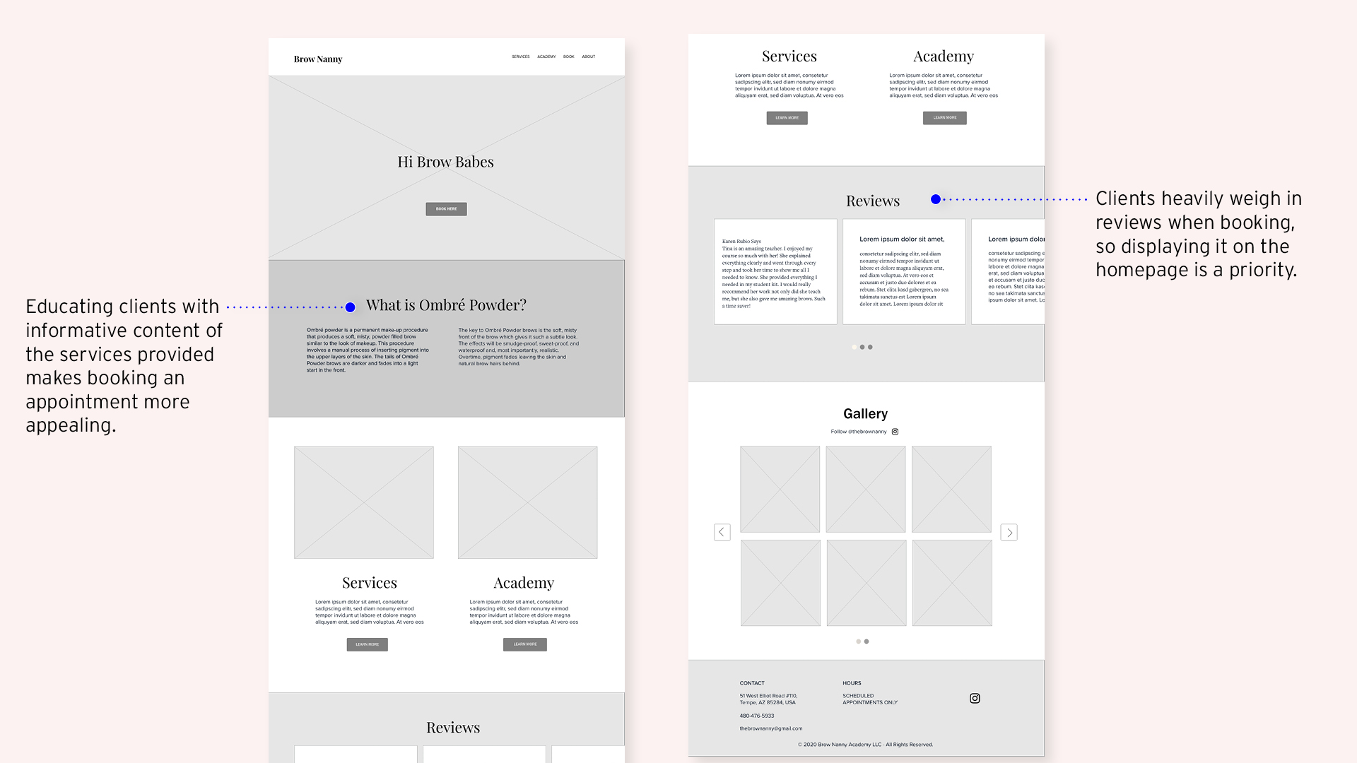
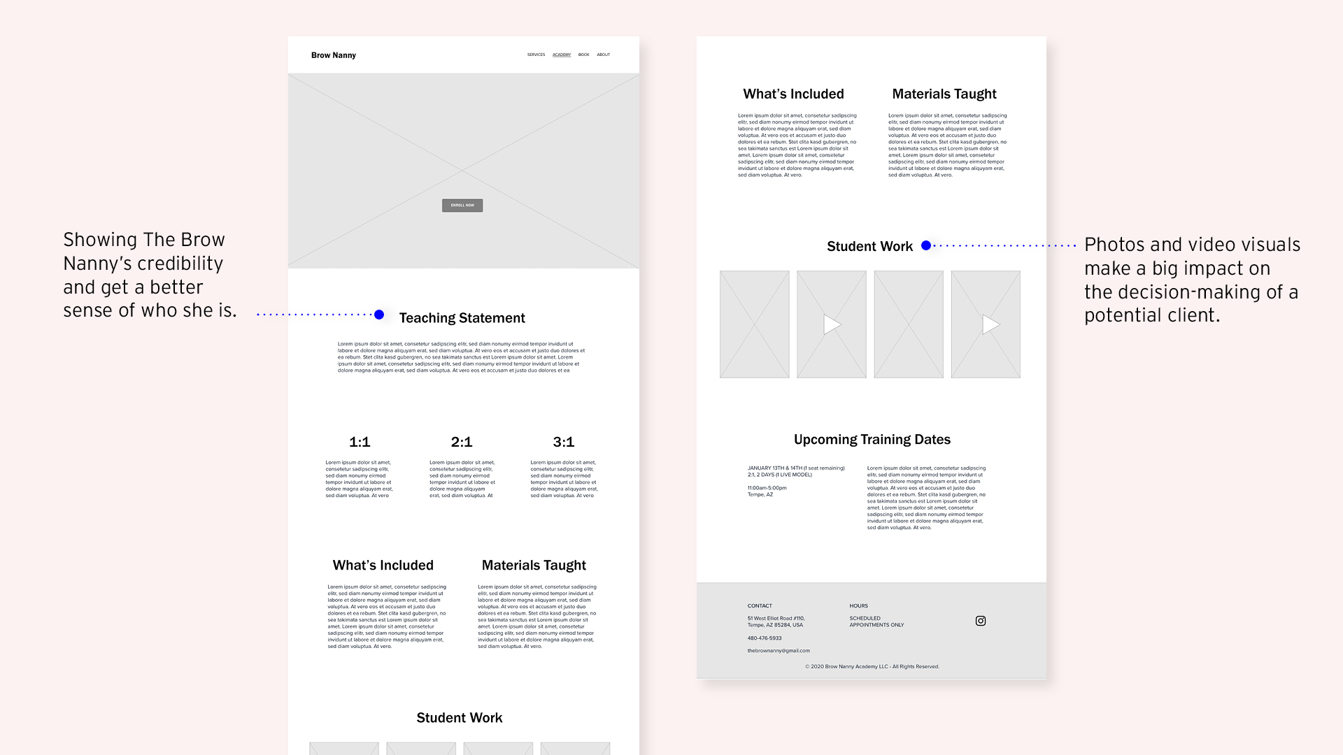
I conveyed key features from sketches to wireframes, addressing how a client would be compelled to book a beauty service that shows that they feel confident is credible and trustworthy.
I then conveyed key features from sketches to wireframes addressing how a client would be compelled to book with a beauty service that shows credibility and trust.
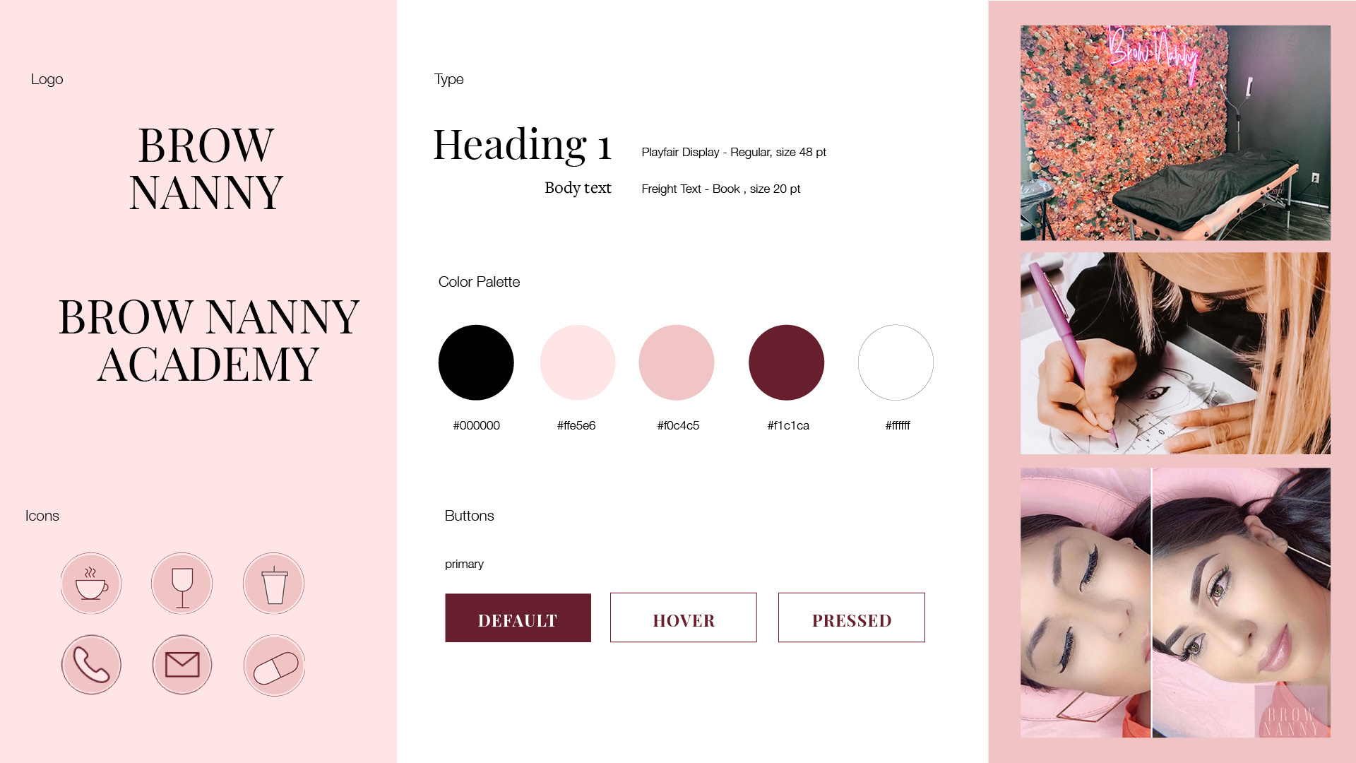
Visual design system
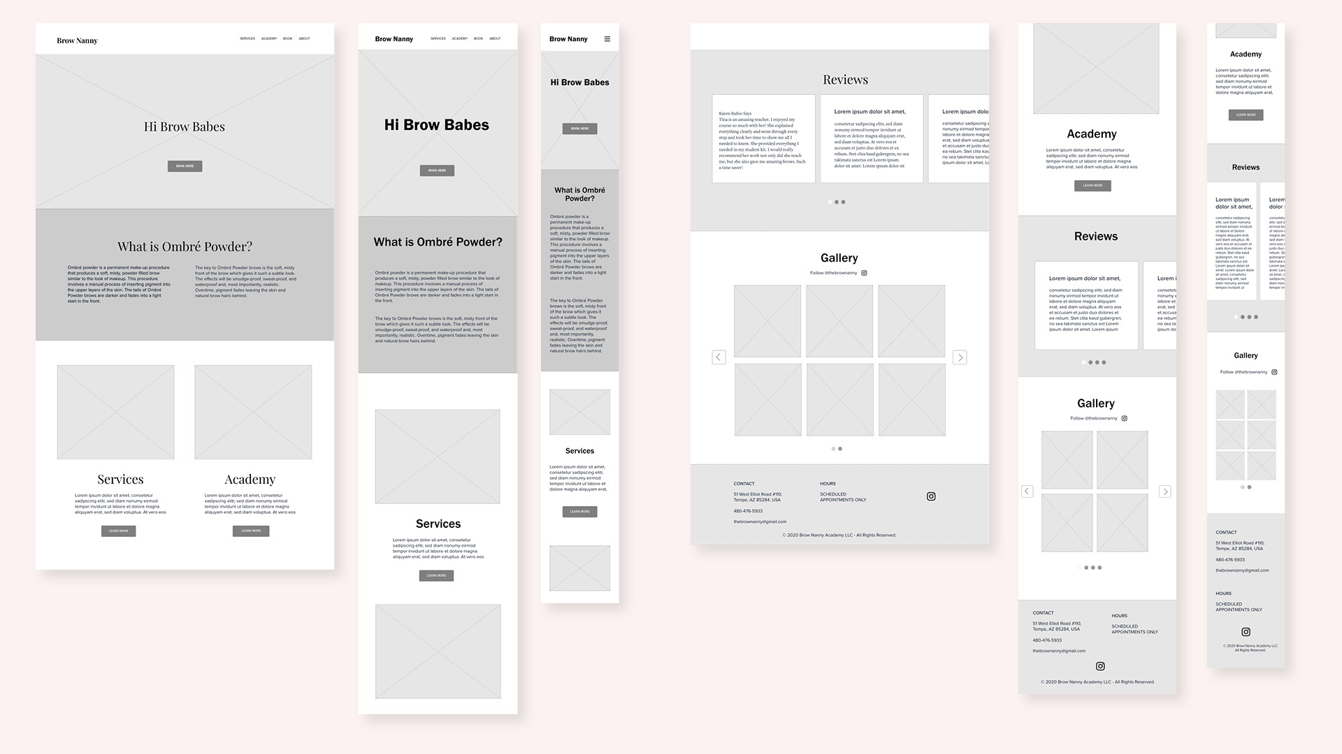
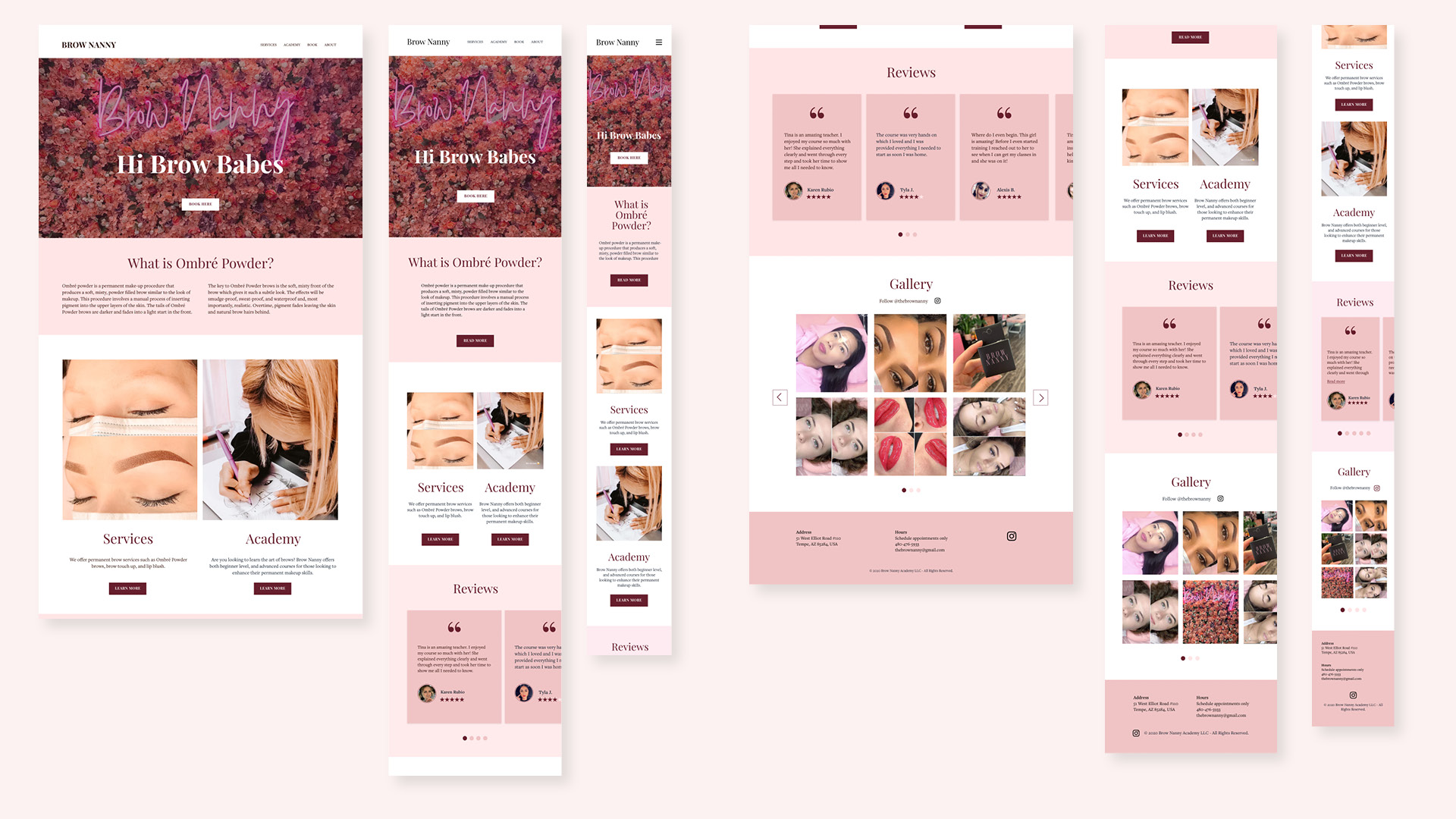
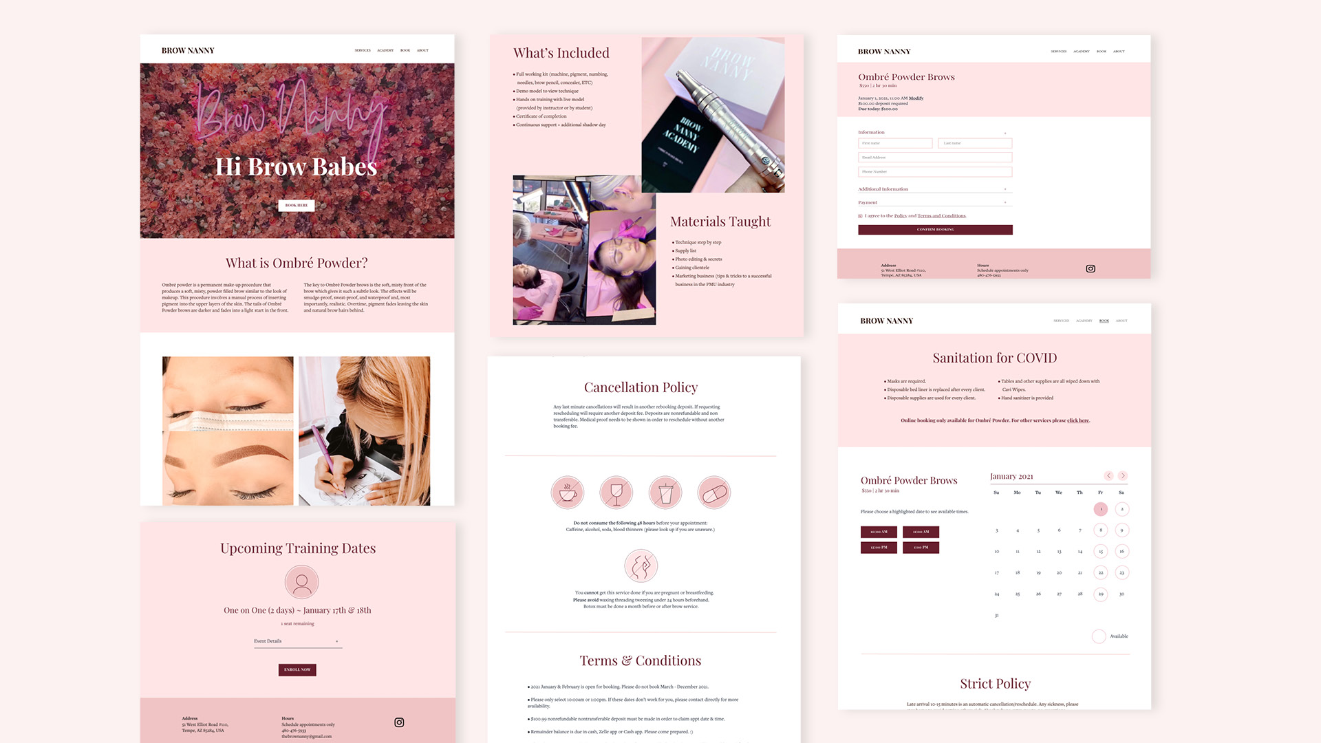
From wireframe to high fidelity mockup
4. Test
Test Objectives
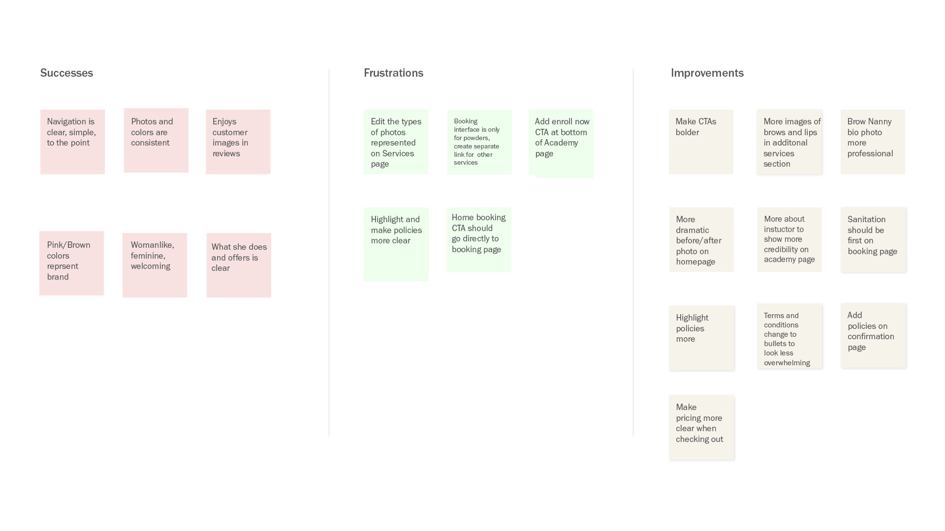
I created a prototype to conduct usability testing with four individuals in order to identify early pitfalls and to incorporate any immediate feedback. The main task-flow was to complete a booking for “Ombré Powder Brows.” An affinity map was then created to layout out the priority revisions.
User Testing Insights
1. More before and after images.
Users want to be sold on the images, since it is a permanent beauty service.
2. Learn More About The Training Instructor and/or Person Providing the Service
Offer a more in-depth explanation of the instructor/service provider to show her credibility, possibly through a brief bio or personal statement.
3. Highlight Important Policies and Terms and Conditions More
Users want to make sure they understand the policies before booking an appointment.
Learnings
Make It Personable and Show Credibility
With a sea of competing brow artists, it is vital to have a strong selling point that makes The Brow Nanny stand out. My research and user feedback helped me to develop a responsive design that is more educational and informative for the prospective customer, guiding them to book a service.
Desktop view
